
Pitchfork Redesign
Rebuilding the discovery experience for Pitchfork, the world's most trusted voice in music.

The world of music journalism is a crowded space, packed with information and increasingly difficult to navigate. In 2015, Pitchfork’s mobile audience was steadily growing, outpacing our ability to evolve and scale the product alongside its growing demands.
We sought to rebuild Pitchfork’s digital platform into an experience that would better support and represent our distinguished editorial voice, and encourage deeper discovery by our readers.
Our goals were to increase traffic and to provide a more effective, delightful experience for our audience.
Joining the conversation with leadership.
Though the entire company had a voice in the redesign project, the key stakeholders were our founder, our president, and the director from each team: editorial, creative, tech, video, sales, and social media.
I was entrusted with owning the project’s design end-to-end, which involved overhauling the user experience, refreshing the brand and visual design, developing a design system, coordinating project management cross-departmentally, and providing direct integration support to our team of four engineers.
Weathering several storms like a champ.
With just four designers total covering the entire ecosystem of Pitchfork, we each undeniably wore many a hat. My additional responsibilities running simultaneously with this massive redesign included all design work for the 10th Anniversary of our Pitchfork Music Festival Chicago, editorial graphics for Pitchfork and The Dissolve, and ad campaign graphics and decks.
With no access to analytics, I leaned primarily on my own research, insights, empathy, communication skills, and intuition to guide the project’s path as best I could. It’s a good thing I love asking questions or I don’t know how I could have pulled this project off!
Cross-departmental communication was just starting to improve thanks to Slack, but the political and cultural climate at Pitchfork was still a tricky area to navigate at the time, compounded by the split of our offices between Chicago and NYC, with no project management roles or even tools in place.
Faced with very little time and even tighter resources, I quickly got to work asking countless questions, studying the history and evolution of the website, and analyzing the wild world of Pitchfork.
The following are three design challenges that excited me the most. Let’s dive in!
Design Challenge 1 / 3
Handing the mic back to our editors
The Purpose
How might we renew a focus on editorial curation, rather than content type?
The Problem
The front page of a publication is widely known as the most valuable real estate, so why was the value of our homepage continually decreasing?

Reaching out to our editors and surveying the site myself, I noted that the top of the homepage only dedicated space for News and Album Reviews. This blocked our editors from curating content in a way that reinforces its value, no matter which section of the site it belongs to.
The Approach
Design a flexible system to revive the value of the homepage without sacrificing engagement by an audience who’d grown accustomed to its current condition.
Before I could begin designing for more pliable components, I tackled several supporting duties:
Editorial Audit
I took inventory of all editorial and graphic components, including metadata scenarios and cross-section text lengths.
Standardized Ad Units
Collaborating with our Sales team to understand their goals and needs, I documented a succinct collection of ad units to include.
Refined Visual Language and Identity
With leadership from my creative director, I revised and expanded our branding and graphic assets package.
Flexible, Scalable, and Responsive Grid System
After consulting with our developers to determine the breakpoints, I created a new grid system capable of supporting our myriad layout needs.
The Challenging Factors
I continued my research and analyses, revealing the challenges and crucial considerations for producing a harmonious symphony of stories.

One of the most challenging factors my editorial audit revealed was the massive range of text length possibilities across all content types. This was mostly due to the limitless character count for artist names and album or track titles. Abbreviating them in any way was strictly off the table.
We’re talking artist names as long as …And You Will Know Us by the Trail of Dead to others as short as Nao, and everything in between.

Not only that, but I found that every type of content came with its own unique set of metadata display needs and header image aspect ratios, so I needed to figure out how to create these modules in a way that accommodated every scenario without constricting editorial needs or creating distracting gaps of whitespace.

To resolve the inconsistent dimensions in place for header images, I streamlined all article and feature page headers as well as artist images to follow a 2:1 image aspect ratio. Albums and Tracks by contrast had to maintain a 1:1 ratio because album art is (almost) always square.
Initially I thought we’d crop Tracks to a circle to differentiate them from Albums. After realizing this would cut too much from the album art, and recognizing that circular avatars were becoming an internet standard, I switched the artist image to a circle crop and created a special blurred effect for Tracks.
The Design Solutions
Part 1 / 3
Now that I understood what I was working with, it was time to design a new homepage, built with malleable modules on a grid system that allowed for any type of content to be featured at the top, where everyone can be a hero.

Exploring ways to feature a particular piece of content (from any department) as a native homepage takeover, I considered scenarios like:
When another legend passes on, how can we takeover the homepage with an honorable tribute?
What if our Video KPI’s are down, so we track down the real Bigfoot to produce a music video so epic we insist it be the only thing you see when you land on our homepage?

Moving those sketches into high-fidelity mocks, I got everyone on board with the power these extra-large modules could provide our stories, but as the deadline crept closer we had to narrow our focus for the MVP, which needed to suit a more typical day’s stories.
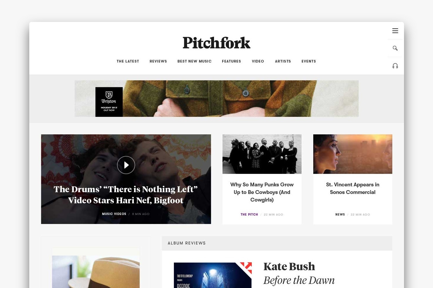
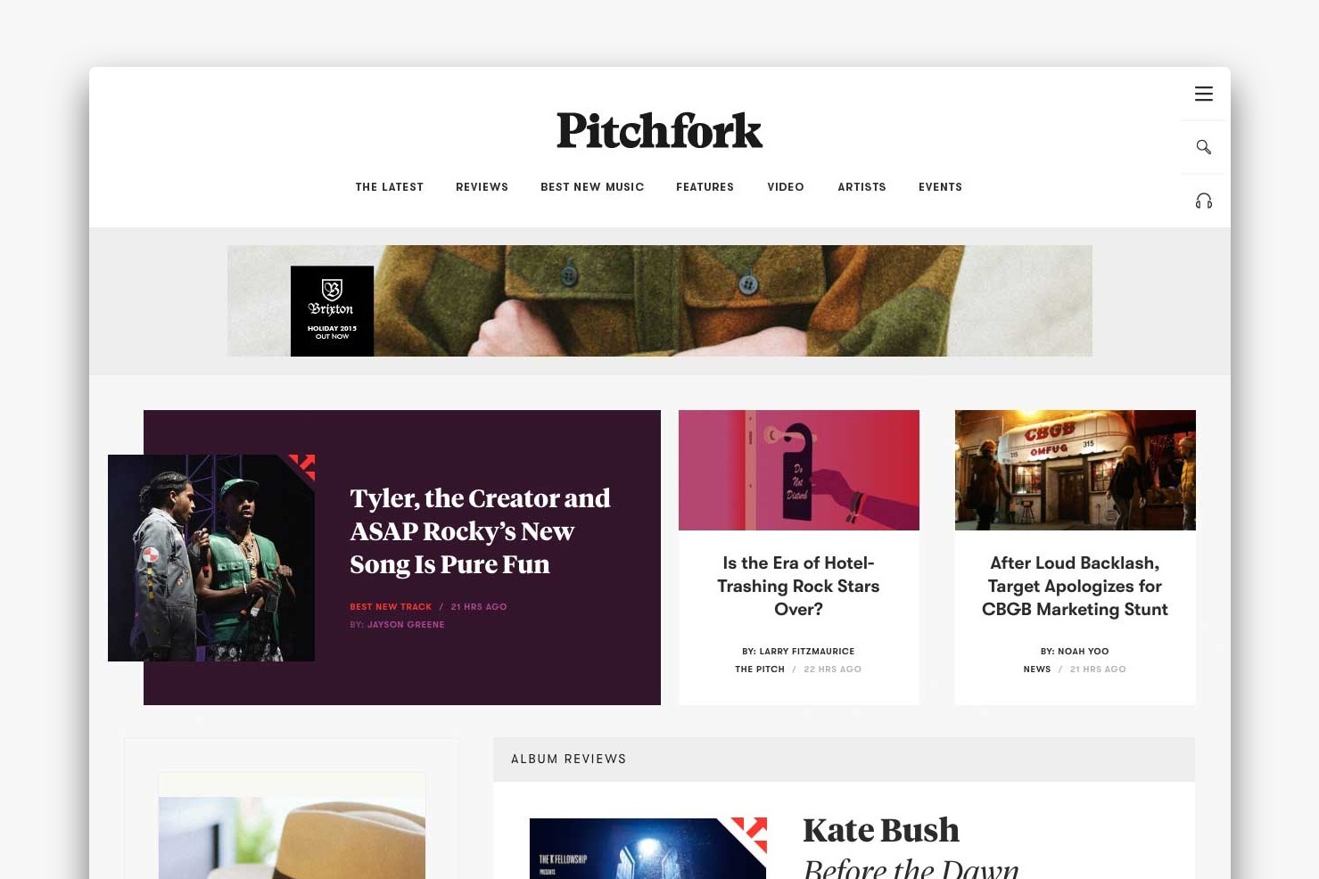
The final solution we launched features three stories at the top, each capable of housing every type of content. In consideration of reading gravity (left to right and top to bottom), I designed the #1 spot to span the left six columns and feature a contrasting design to the “card” display of other stories.
This design also kept the top section’s height short enough to allow our Album Reviews to maintain a prioritized presence on the page.
The Design Solutions
Part 2 / 3
Moving on to Album Reviews: the Los Angeles of Pitchfork. Our star content, they see more traffic than all other content on our site. They’re tough to design for because each one is a beautiful snowflake with names, albums, and tracks titled however long or short they damn well please. It’s fair and fine and we love them, but how on Earth am I to build one home to suit them all?


Understanding the celebrity of our Album Reviews, the request for them to live as close to the top of the page as possible came as no surprise. No problem.
However, one aspect of editorial’s new mission towards flexibility and curation created an interesting design challenge: the Album Reviews Module needed to scale according to a variable amount of Reviews to feature each day.

This sent me into high-fidelity explorations into different ways we could fit a variety of reviews into the new layout so they could live harmoniously with the other content.

Ultimately, their significance was diminished when mixed in so heavily with the other content types, so we decided to keep them in a dedicated container, but one built to last.
I gave them the 2nd-best seat in the house: just below the three heroes (which, remember, could now also feature an Album Review if need-be), and locked them in with the 300x600 ad unit space that provided the flexible height for their shifting text lengths.
Design Solutions
Part 3 / 3
Rounding out the homepage, I designed additional opportunities for editorial curation. This both excited and terrified our editors at the same time. Were their plates about to get piled even higher with this new responsibility for constant content curation? We could not have that!
To resolve this issue (and alleviate editorial angst), the developers built the curatorial sections to display stories chronologically by default. I provided additional spaces for categorized stories to do the same, geared towards users especially interested in a nice long read, or watching our latest video entertainment.


An especially different product feature introduced with the redesign at leadership’s request was The Latest—a grouping of all News, The Pitch, and Track Reviews—in an effort to provide a more fluid environment, particularly with our Quick Consumption user journeys in mind.
Working through ways to have each of these pieces live in the same space as our additional content (like Features and Video), I iterated through synthesizing elements that didn’t need obvious differentiation from one another, striking a comfortable, useful balance for those that did.

The Outcomes
Voila! With our editors now in control of curating top stories, and the homepage chaos organized, we were ready to launch our new homepage!
Digging around for any analytical feedback I could get my hands on after the MVP launched, I learned that time spent on our homepage had grown so much that we took the lead over all other Condé Nast brands. We had successfully ignited a renewed interest from our users. Hooray!

The top section can accommodate every type of content in any of the three active modules, our album reviews land within view of all target desktop viewports, it scales nicely down to mobile, and the overall layout serves as a dynamic grid within which we can find future opportunities to evolve and try new things without having to break anything or start all over again.
Design Challenge 2 / 3:
Keeping people on our site
The Purpose
How might we make it easier for users to find what they’re looking for within Pitchfork, instead of relying on an external search engine?
The Problem
Users are googling our content rather than using our own search tools. We all love our Google, but why are people leaving our site to find something published on it?

Thinking about it from the perspective of our users, I started analyzing the discovery options available and found the state of things to be in a real mess.
While the search tool took a step in the right direction by offering some related content as a user started typing, it was displayed within a container too small to easily comprehend contextually (reversing its intended usefulness). It was so small that it left users with only a small window within the cluttered page to begin their hunt.
Artists themselves—the heroes of our content—were barely represented across the site beyond body text links (controlled by an editor’s efforts to do so) and small textual tag links proceeding an article.
Speaking of tags, their small scale and buried location hardly served as an effort to encourage deeper music discovery. Furthermore, the tagging process was a mess, with slight variations of the same artist or keyword resulting in incomplete archives.
The right rail was implemented to house ads, but—due to engineering constraints—had become the only space available for ancillary needs, like related content or promotional messaging. Instead of designing for the reader’s experience, we were designing for the only space we had available.
The Approach
Reconfigure article pages to function as launch points for related music discovery, while resolving cognitive overload issues.
We needed stronger, more intuitive tools designed to provide more useful methods for deeper, user-focused exploration, especially from the article page level.

Here are some new and improved discoverability tools I designed as part of that experience:
A focused, streamlined search experience
A robust tagging system, including the introduction of genres
intuitively allocated, interactive metadata
Infinite scroll, promoting a more natural, effortless reading experience
Recirculation modules capable of housing any type of content
The Design Solutions
Let’s take a look at how I brought all of these components together on a News article page, a space for generally quicker reads, but chock-full of opportunities to bounce into related pieces of content.
I worked with the News team to document the most common types of stories, briefly define each, and look for missed opportunities to enhance each one. With so many moving pieces, it was quite the challenge to configure them all into an organized reading environment.
Breaking the story structure down into three parts—Header, Body, and Footer—I began iterating through adaptive layouts for the elements within each.


The Outcomes
Reconfiguring these article pages resulted in the creation of a valuable ecosystem, giving life to related videos, photos, and stories that offered further content discovery.

I reworked recommended content and other recirculation modules, including an all-new display for artist entities at relevant moments throughout the site. This created an easy launch point for users to dive into all of our coverage about a particular artist.
I thought about ways we could embed any type of native content within an article, like the Feature and Video shown at the end of the story shown here. Distinguishing a visual hierarchy between types of recirculation points made it easier for users to navigate so many different methods of discovering related content.
With a more natural reading progression, users now got the topical parts of the story first (what happened, which artists are involved, who write the story, etc.), followed by the story stripped of unnecessary distractions, and ending with easy options to either jump into another related piece, or continue on through the new infinite scroll feature.
Design Challenge 3 / 3
Learning how to work with ads
The Purpose
How might we create new, unique opportunities for advertising throughout the website, prioritizing partnerships rather than squeezing them in as an afterthought?
The Problem
Remember that rigid structure I talked about during the homepage design challenge, and the right rail I got rid of in the discovery design challenge? Well, these constraints also significantly hindered our Sales team from innovating on brand partnerships and growth opportunities.

There was a spot at the top of the page for a standard banner ad, but it felt misplaced, floating among the surrounding elements of the header.
The right rail accommodated another standard ad unit—300px width and either 250 or 600px height—but confiscated a major percentage of the viewport.
The Approach
Create intuitive spaces for new advertising opportunities that support Pitchfork’s editorial missions rather than undermine them.
The leadership team defined a set of rules for the company as we approached the redesign. They aimed to position Pitchfork as an ally to advertisers, assisting them in breaking through the web’s clutter and reaching audiences in innovative ways.
Our aim was to remain truthful and upfront with our users about what is an ad, to create the best possible experience for our users and advertisers alike.
Clarified ad operations
Resolve the gray areas, forming a stronger bond between sales, design, and engineering to better support leadership goals.
Standardized ad units
Don’t create limitations for our Sales team. Rather, enable ads that adhere to a flexible and responsive design philosophy.
Innovation over comfort
Push ourselves outside of our comfort zone by creating multiple innovative options for larger, more engaging executions.
Logical arrangements
Create space within our framework for native and non-native promotions that don’t feel like an afterthought.
The Challenges
Leaderboards, interstitials, and billboards, OH MY! At the time, my experience with advertising on the web was slim… we’re talking pancake knowledge levels. I’d overhear the Sales Director talking about “billboards” and picture the highway.

I reached out to the Sales team to better understand their world and to gain insight on what a perfect world would look like for them. I learned things like:
the standard size & specs for video interstitials (and what constitutes as an “interstitial”?)
the different types of mobile and responsive ads
what the refresh rate is on an ad
They guided me around the learning curve and shared documentation with me about the latest from IAB, which I quickly learned is the bureau setting standards for the online advertising industry.
The Design Solutions
As a site-wide element along with things like the header and navigation, ad units remained at the top of my mind throughout the redesign process, especially at the start of each design challenge. Content needed to fill in around them, respecting advertisers by providing a memorable execution without blurring readers’ interactions with editorial.
A key takeaway from my talks with the Sales team was that visibility of the 300x600 and 300x250 ad units would improve if we kept their container sticky as a user scrolls, an approach we found successful with The Dissolve—our film website—a couple years earlier.

The focus for the MVP launch came down to the necessities: figuring out how to fit banner units near the header in a way that felt purposeful, and the 300px-wide units within the content elements on every type of page.

The Outcomes
Navigation above the banner ads creates a win-win situation for everyone involved, and our Sales team gets their wish for a sticky sidebar ad.

After several iterations with the banner ad above the start of the rest of the webpage, it was discovered that our back-end advertising system would be changing to meet our new (head company) Condé Nast’s requirements.
This meant allowing for much larger banner units to be routed in, which could potentially push our content down so far on smaller screens that some users would not have visibility on a single Pitchfork-specific element upon landing to our site. Yikes!
Moving the banner ad below the navigation bar yielded better results anyway, favoring a consistent spot at the top of every page for users to navigate from.
Taking it all in…
Since launching this redesign in March 2016, traffic to pitchfork.com has tripled, and continues to steadily grow.
In a time of utmost importance, when both media and music industries are in a state of transition, we were able to foster and build new trust from our readership.

Check out rank2traffic.com/pitchfork.com for a deeper dive on these analytics.
A labor of love, this massive redesign not only skyrocketed my design skills, but it tested me in ways I never thought possible.
It strengthened communication and trust between me and the rest of the company, positioning us to make more informed decisions for future design projects.
Speaking (and giggling) with my fellow designers at “An Evening with Pitchfork” — a special CreativeMornings Chicago event at the Museum of Broadcast Communications. 12/6/16
Since this launch, we’ve seen a huge increase in time spent on the site, and users are navigating through more pages per session, meeting our goal of increasing audience engagement.
Traffic has continued to grow exponentially year over year ever since, far exceeding our other primary objective to grow our audience. We’ve also seen a tremendous increase in content shares on social media, and major growth for each of our social accounts.
The particularly challenging obstacles I faced during this project kept me from being as tightly organized to my typical standards. My documentation was spread across a handful of sketchbooks, countless email threads, and files labeled and stored in wild disarray. This caused my writing of this project story to be considerably more difficult to piece together nearly three years later. Lesson learned!
Despite the internal block from analytics I’ve encountered, I never tire of the user feedback that finds its way to my inbox, whether positive or criticizing.
Hey, just want to say that your work on the new Pitchfork’s website is awesome. I was amazed for like an hour looking every aspect of it. The reading experience is phenomenal, looks beautiful, the UX is great in every detail, the information architecture is simply and direct, the performance and responsiveness is also awesome. Is a really cohesive piece of design. I was looking the staff page and was inevitable wrote this email to you, the design team. Congratulations.
Anonymous User
3/30/16
Praise from my happy stakeholders also flooded in, and I was selected as the 2016 Business Accelerator of the Year Award Recipient for Pitchfork by Condé Nast.
Since starting at Pitchfork almost 4 years ago, Joy Burke has worked tirelessly and selflessly to master her design practice, and we have not seen someone professionally grow more than she has, becoming quite literally a best-in-class leader in her field.
In 2016, this was realized through the unselfish yet commanding lead she took on the design of Pitchfork’s first redesign in four years. Aesthetically keeping with the voice and identity of Pitchfork, and a user experience that loyal readers of 20+ years could still depend on, she rocketed our site into a forward-thinking place that elegantly accommodates modern display advertising while introducing a robust branded content business into our day-to-day. The site’s design made it possible for us to keep our traffic and performance KPIs competitive, and allows us to proactively look to the future of our business without our core product falling behind.
Since the redesign, her improvements to the site have only made monetization possibilities stronger, and she does it while building our digital festival presence and interactive editorial and advertising products effortlessly.
Chris Kaskie
Co-Founder and President
of Pitchfork 2004–2017
Most of the Internet was happy about it, too.
Pitchfork redesigns website and introduces new logotype
It’s Nice That — March 15, 2016
Pitchfork Wordmarks & Typeface
Grilli Type
A Closer Look at Pitchfork’s Refined Redesign
Look&Logo, Medium — January 4, 2017
Pitchfork Website
Siteinspire