Catch App Strategy & Redesign
Elevating the fintech startup’s end-to-end product experience to convert hesitant adopters into committed shoppers
Lead Product Designer, Catch ・ Launched Feb 2025
iOS Mobile App, Mobile Web & Desktop
Background
Catch launched a digital debit-powered rewards card in late Summer 2024, a first of its kind offering consumers cashback and perks at select beauty & apparel brands, while helping merchants save on credit card fees.
Launching activations on various campuses revealed a clear market fit and target demographic. Students were wildly excited about the concept of free debit rewards and the brands they could shop using their Catch card. We also learned invaluable perspective watching them use the product live.
Timeline: Jan–Feb 2025 (2 months)
The Team
Lead Product Designer (Me)
1 Product Manager
3 Engineers
My Contributions
User Research
Strategy & Vision
Company Alignment
UI/UX Design
Problems
The success of the onboarding redesign in late 2024 brought more users into the app, but onsite user research and UXR sessions revealed three key problems once they landed:
They didn’t know what to do first/next.
They didn’t truly adopt the Catch card.
They didn’t see enough value to return later.

led strategy sessions with stakeholders to determine key problems & focus areas
I led strategy sessions to help us understand and align on our approach to bridging user needs with business objectives:
What are relevant shoppers’ needs and desires?
What problems are blocking shoppers from meeting these needs?
How might Catch resolve these issues to meet shoppers needs?
What measurable shopper actions will lead to Catch’s desired business outcomes?
What measurable business outcomes are we after at Catch?
I then solidified our core problem statement, mapped user needs and pain points to 3 phases of the user journey, partnered with Data to determine north star goals, and plan the next scope of work.


Strategy presented in all-hands for full company alignment
Approach
Redesign the app to help users easily understand how the Catch card works (use it everywhere like your debit card) and why it’s valuable (rack up rewards to amazing brands).
Explorations
Given the exceptionally tight timeline (1 month), I rapidly explored opportunities to build trust and clarity, landing on three key updates:
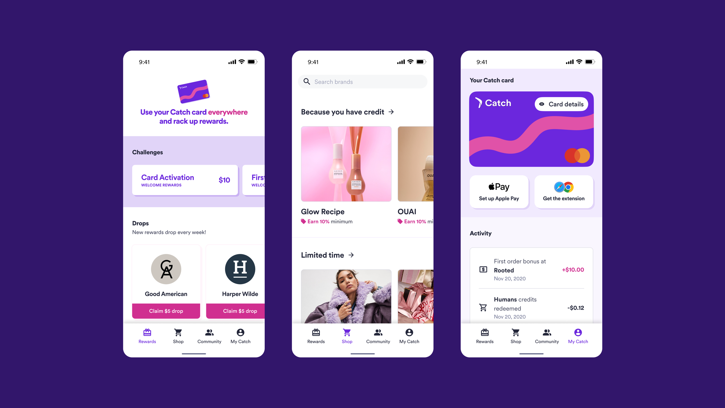
Rewards tab as the landing page instead of Shop
Educational moments woven throughout
Interactive, engaging Welcome Rewards

Wireframed concepts for new welcome rewards feature
I carefully considered what users might expect landing in the new app after experiencing the newly redesigned, engaging onboarding experience:

Fresh onboarding redesign
I explored placing the card more prominently (welcome message, top nav), engaging modules for earning rewards, and redesigning the Wallet to highlight reward value.
Ultimately, I removed the sticky top nav, keeping only the bottom nav to maximize screen space and improve interface focus. Engineering helped us scope the Wallet redesign to Phase 2.

Exploration

Decision
How else might we supercharge this redesign?
Thinking more about users starting to get excited about the new app, and having witnessed during our onsite activations how many users would immediately want to tell their friends about Catch, I found another opportunity to improve the friend referral feature as part of this redesign.

Before

After
The Solution
With ambiguity cleared thanks to a redesigned system of polished, user-friendly UI and features for driving understanding and delight, the new design enabled rewards to shine center-stage.

Mobile app Solutions

Mobile Web & Desktop Solutions
Impact
50% increase in conversion: Users who activated their card and made a purchase within first week on Catch, subsequently also increasing user retention
30% increase in WAU in first month
Next Steps
Redesign the Wallet to increase understanding and boost redemptions
Iterate on Community Credits to clarify expiration parameters and overall usability
Shift into Phase 3 of the user journey to improve shopping and redeeming experiences